
Customizing Your Theme(s)
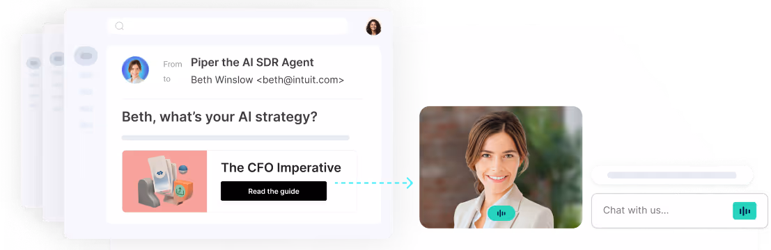
Themes is where Admins can customize the appearance of the Messenger and Meetings widgets to match your brand's colors, fonts, and logo.
- Getting Started
- Global Theme Styles
- Widget Style: Messenger
- Widget Style: Meetings & Forms
- Privacy Disclosures
- Multiple Themes
<span id="getting-started"></span>
Getting Started
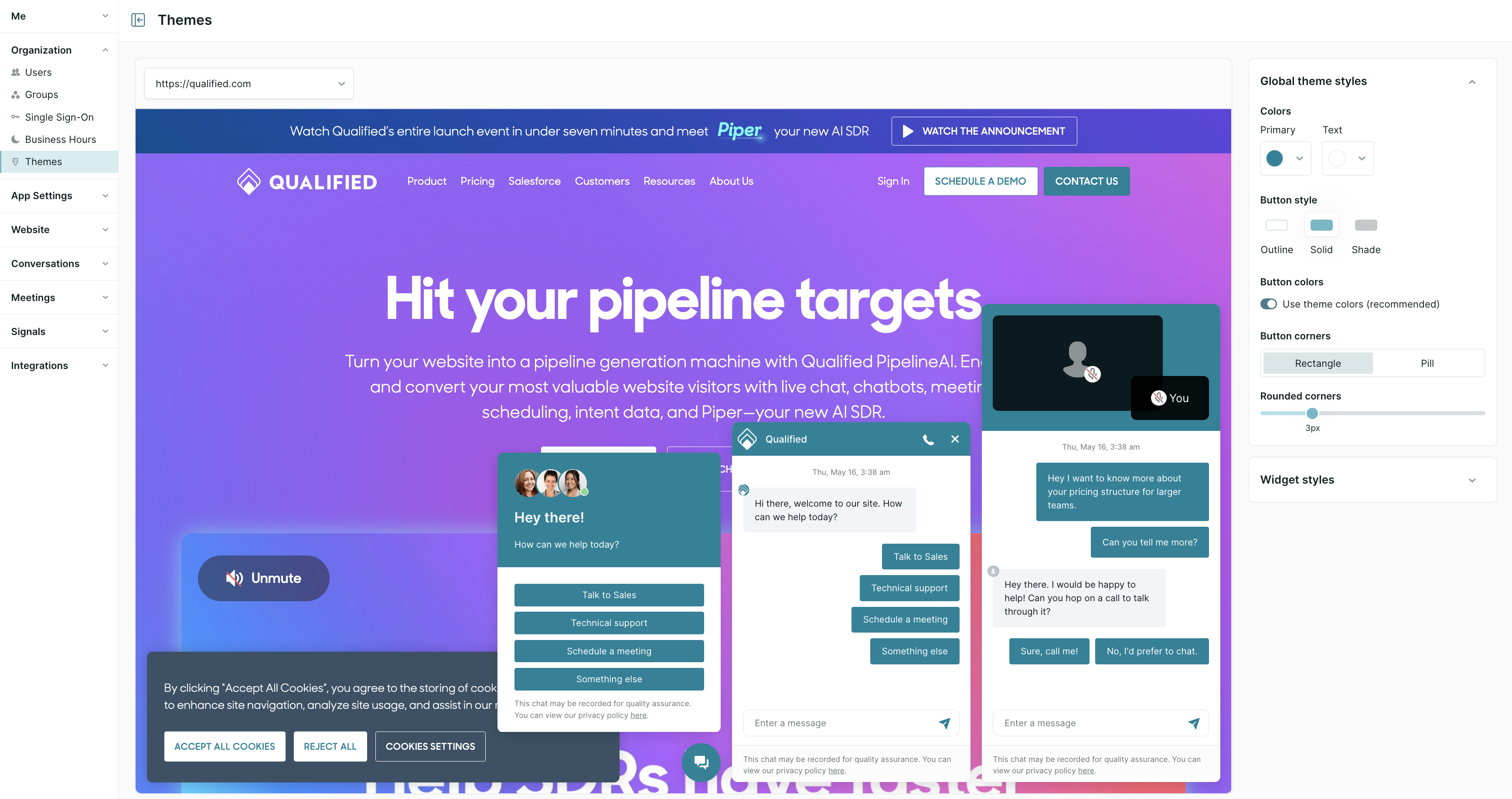
To start customizing your Qualified Theme(s) as a Admin, go to Settings → Organization → Themes.
If you have the Multiple Domains and Brands feature in your Qualified account, you will see a few additional options. Learn more about setting up Multiple Themes.
Note: Any changes to your themes will immediately take effect anywhere your Qualified messenger is installed.
<span id="global-theme"></span>
Global Theme Styles
Colors: Choose which colors are used in your Qualified messenger.
- Primary: Pick your messenger's main color, which appears in chat messages' background, the messenger's header, and buttons' background (if reps don't allow voice and video).
- Text: Pick the color of the text in your messenger header and chat messages.
Button Style: Modify how buttons inside the Qualified messenger look:
- Style: Decide if the buttons are Solid (fully opaque background color), Outline (color border around the button’s text), or Shade (less saturation in background color).
- Colors: Apply your theme’s primary color by default or select a different one.
- Corners: Choose if you want the buttons to be Rectangle shaped with rounded corners or an oblong oval Pill.
<span id="messenger"></span>
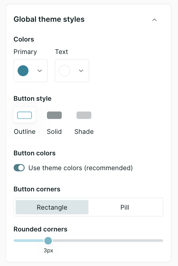
Widget Style: Messenger
Customize what visitors see along the top of the messenger when chatting with a bot or a rep, and preview it before you save you changes.
Title: Enter the title you want visible at the top of the messenger, such as your company's name.
Messenger logo: Upload a logo that appears within the messenger, next to the title. There are two requirements:
- Size: 128x128
- File type: PNG, JPG, or GIF (An uploaded GIF will appear static and not animate.)
Background: Select a Color or upload an Image (342x48) to appear behind the messenger header’s title and logo.
Shape: Select the shape of the launcher button.
Graphic: Choose an Icon or upload an Image to appear in the launcher button.
Background color: Apply your theme’s primary color to the launcher button or select a different color.
Video background type: When reps allow voice and video, select what appears behind the rep and visitor’s videos in the Qualified messenger. Pick the Color or upload an Image to appear in the video box.
Additional Settings: Configure the additional settings as necessary.
- Allow visitors to initiate video calls*: Choose if website visitors can start a video call. If not selected, only sales reps can begin a video call.
- Allow visitors to call your reps*: Choose if Qualified voice is enabled within the messenger.
- Only play alert sounds after the visitor opens the messenger: Send an audible alert only if a visitor opens the messenger, rather than alert your reps every time a new visitor is on your site or when a rep pounces.
If your account has Qualified voice and video enabled, then the Allow visitors to initiate video calls setting is listed. If your account has Qualified voice, the Allow visitors to call your reps setting is listed instead. Please contact your Qualified Success Architect or email help@qualified.com if you have any questions.
<span id="meetings"></span>
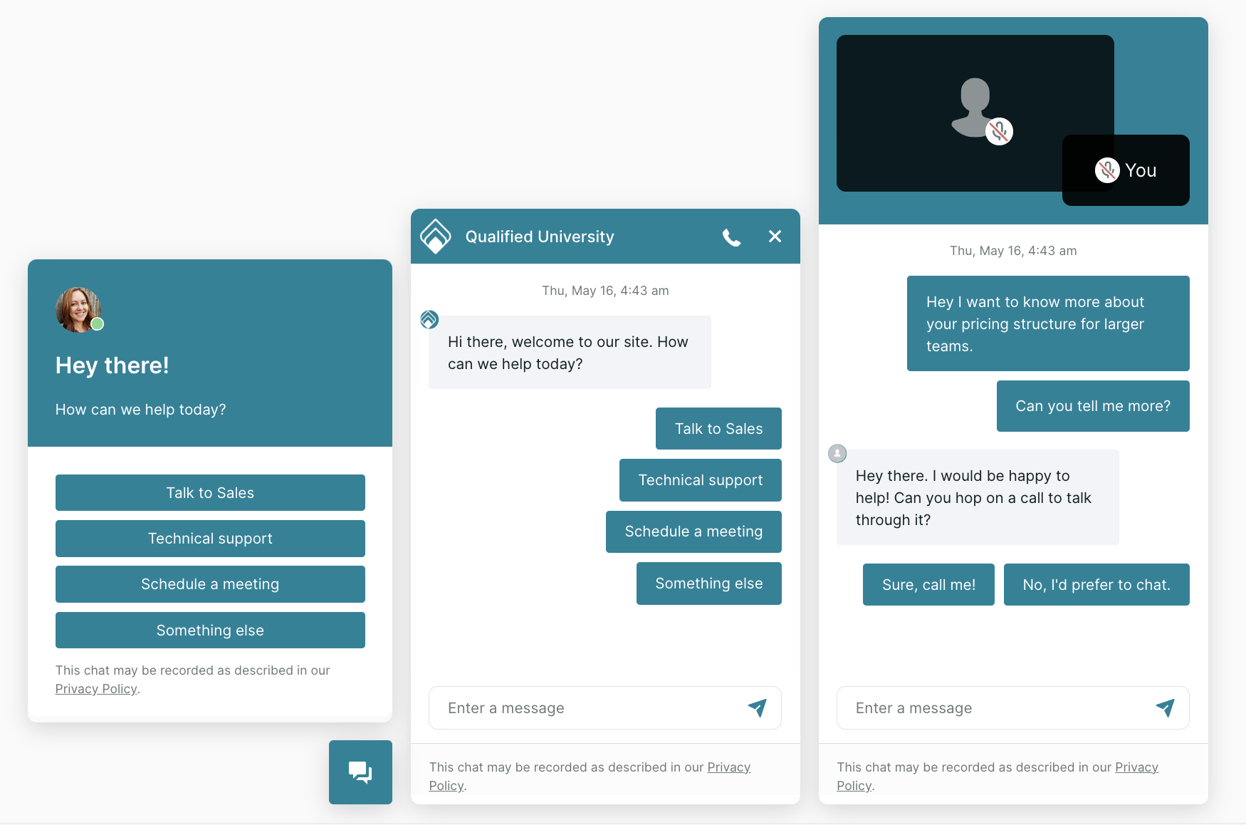
Widget Style: Meetings & Forms
Customize what visitors see when they click a reps personal Meeting Link. Preview how the Meeting widget will appear on the Meeting Link landing page and your website.
If you have Qualified Meetings in your plan, you'll see the option to customize the Meetings widget style as well. If you do not see this option, but believe you should have it, contact your Qualified Success Architect.
As you are customizing the Meetings widget, you can use the options at the top to preview how it will look on the Meeting Link landing page and Website, as well as Desktop vs. Mobile.
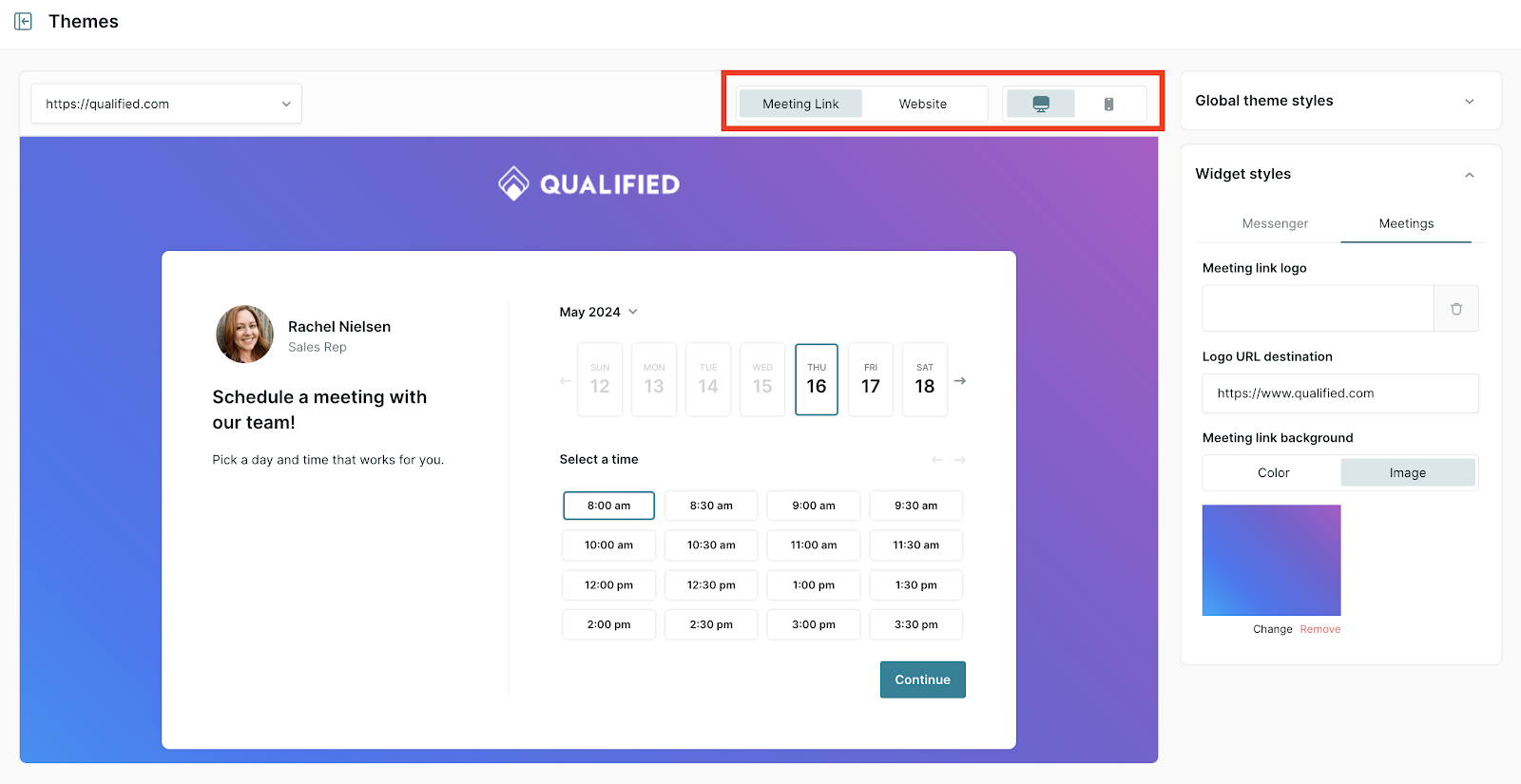
Meeting link logo: Upload a logo that appears at the top of the Meeting link landing page.
Logo URL destination: Add a destination URL is the visitor clicks on the Meeting link logo.
Meeting link background: Apply a solid color to the Meeting link background, or upload an image (must be at least 1280x1024).
<span id="privacy"></span>
Privacy Disclosures
At the bottom of the Messenger and Meetings & Forms Widget settings, customize the privacy disclosure that appears at the bottom of the messenger, and use markdown syntax to add a link to your company’s privacy policy. The character limit is 250 characters by default. If this needs to be increased, contact your Qualified Success Architect or help@qualified.com.
Qualified will use the Messenger privacy disclosure when showing the Qualified Messenger, and the Widgets & Forms privacy disclosure when showing a light box pop-up, such as in the Qualified Meeting Booker or in Qualified Offers.
You can create multiple versions of the privacy disclosure for different languages. The translation shown to the visitor will be determined by the language set for the Experience they receive on your website.
<span id="multiple-themes"></span>
Multiple Themes
If your Qualified plan includes Multiple Domains and Brands, then you will see additional settings that allow you to configure multiple themes for different domains.
Create a New Theme
1. Under Settings → Organization → Themes, click the dropdown at the top of the page and you'll see a button to Create a new theme.
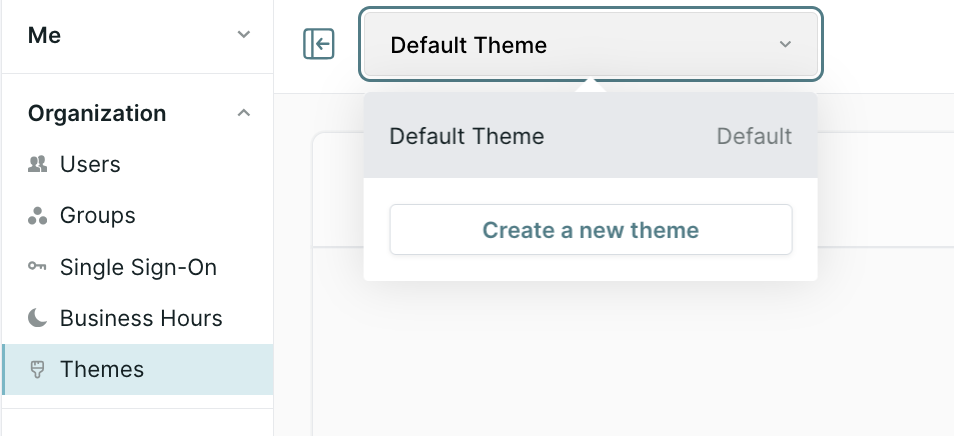
2. In the pop-up, add a Theme name, optionally choose to Set as the default theme, and add the domain(s) it should apply to in the Display on domains field.
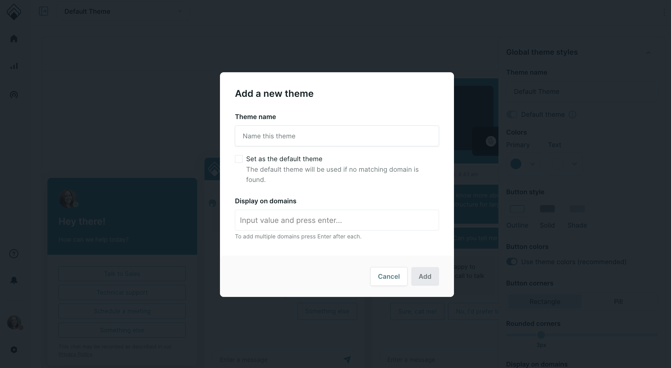
3. Then click Add.
4. Customize the theme starting with the Global Theme Styles. Note: you must add a customized Privacy Disclosure before you can save.
5. Once completed, click Save.
Edit an Existing Theme
Go to Settings → Organization → Themes, click the dropdown at the top of the page and select the theme you want to update. Then, update your theme using the guidance above.
Heading 1
Heading 2
Heading 3
Heading 4
Heading 5
Heading 6
Lorem ipsum dolor sit amet, consectetur adipiscing elit, sed do eiusmod tempor incididunt ut labore et dolore magna aliqua. Ut enim ad minim veniam, quis nostrud exercitation ullamco laboris nisi ut aliquip ex ea commodo consequat. Duis aute irure dolor in reprehenderit in voluptate velit esse cillum dolore eu fugiat nulla pariatur.
Lorem ipsum dolor sit amet, consectetur adipiscing elit, sed do eiusmod tempor incididunt ut labore et dolore magna aliqua. Ut enim ad minim veniam, quis nostrud exercitation ullamco laboris nisi ut aliquip ex ea commodo consequat. Duis aute irure dolor in reprehenderit in voluptate velit esse cillum dolore eu fugiat nulla pariatur.
Lorem ipsum dolor sit amet, consectetur adipiscing elit, sed do eiusmod tempor incididunt ut labore et dolore magna aliqua. Ut enim ad minim veniam, quis nostrud exercitation ullamco laboris nisi ut aliquip ex ea commodo consequat. Duis aute irure dolor in reprehenderit in voluptate velit esse cillum dolore eu fugiat nulla pariatur.
Block quote
Ordered list
- Item 1
- asdfasdf
- asdfasdf
- asdfasdf
- Item 2
- Item 3
Unordered list
- Item A
- Item B
- Item C
Bold text
Emphasis
Superscript
Subscript
|
|---|
|


.svg)


